
This is a nerdy one. Be warned…
One of the things I’m doing right from the outset, that I should have started doing many years ago is tracking my time. I started doing it this week as Jesse, our course lead, had this interesting slide which illustrated the desired workload.
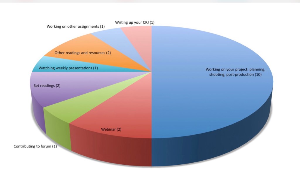
The really exciting thing for me there is that half the time is dedicated to actually producing work. It’s truly practice-led. That is very exciting for me, having just burnt out on an MA that was more part-time than this but was asking me to read in excess of 200 pages of dense academic text every week. It’s early days yet, but the balance here seems much more reasonable. Effectively a 60/40 split according to Falmouth.
Time Tracking
So I downloaded an app called Clockify and started tracking how I was spending my time, quite religiously. I’ve tried this in the past but never managed to get beyond a day before being distracted and forgetting. However, I’m treating this MA like a job, I want to get more than a qualification out of it. I want to get my practice firing on all cylinders.
The result in Week 1 was this:
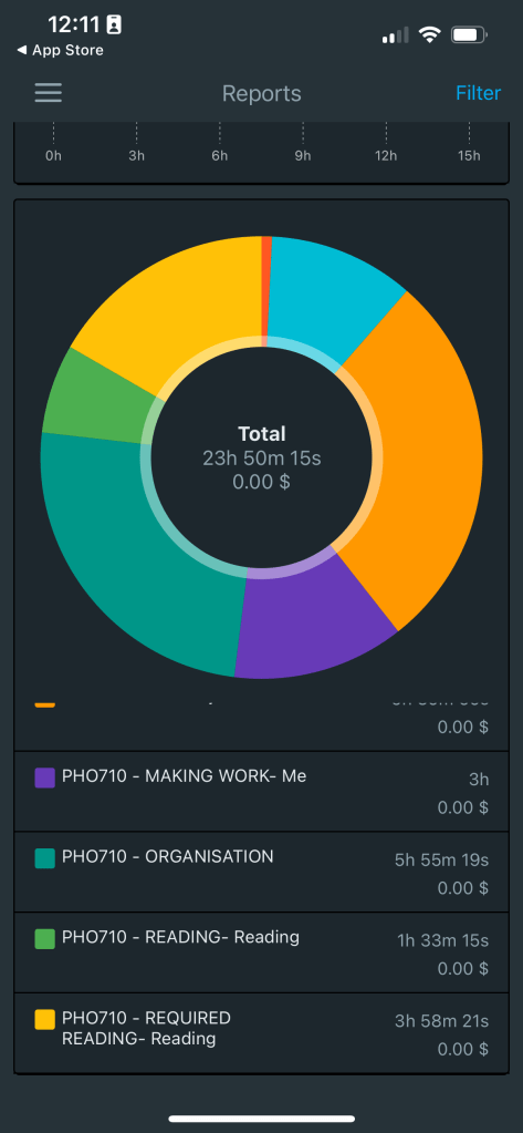
You’ll notice the purple bit (making work) is quite small this week. But that’s because in week 1 there’s a ton of prep work, admin and also I had to build this blog (well… I wanted to). The goal is to make that purple bit expand to fill half the chart. A challenge that excites me no end!
The really important bit for me is that it allows me to set time boundaries for certain things. In particular the reading, which can cause me to lose track of time, get sucked down huge rabbit holes and end up spiralling away in flames. I’m not afraid of academic reading but it really is work to me, so adopting a “done is better than perfect” mindset and not letting it get beyond the boundaries I’ve set here (the brighter green and lighter yellow sections) is ideal. That, by the way, is a small fraction of the reading load I was dealing with before.
Health Tracking
The reason this is important, is because of another graph:
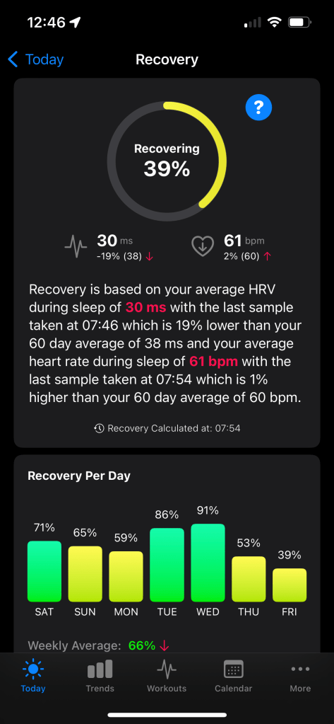
That lower graph represents my recovery on a day by day basis. I suffer from MECFS and Fibromyalgia, so tracking this helps me manage my energy and often avoid having huge crashes. It uses a thing called Heart Rate Variability (HRV) – a stat used by athletes to track and plan their training workload; over the worst of the pandemic it became clear to a huge community of people that it was also very good at showing you if you were unwell. In particular, it’s been a massive help to people in the MECFS/Long Covid community, and for me – now that I understand its limits and have found tools that work for me – it’s become a part of my daily routine.
I’ve become quite obsessed with tracking the data and finding new tools to help with that. The reason for that is that my life has become immeasurably better since I started using it. I’ll dedicate a rambling post to that subject later on in the year. Just know that- for now – these two graphs are the most important tools for making sure that I can get things done. Setting time boundaries. Not because time is money, but because time is energy.
And that, I think, is amply illustrated by the declining bar chart at the bottom. I can see that I’m heading towards a crash, so I can rest from today until I start again on Monday. I can react according to the data and adjust.
I don’t know if I’ll do this style of post again, but a simple record of time and health each week might be good. I know for sure that I can tell if I was ill when I made work just by looking at it. So maybe this is a small part of the process of this new practice that I’m starting to establish.
We’ll see I guess.
